This is a cool cracked asphalt background I made for websites and stuff. I’m going to be using it in a website I am currently building…

Page 1 of 1
Posted by Sam Kressin in Design Work
This is a cool cracked asphalt background I made for websites and stuff. I’m going to be using it in a website I am currently building…
Posted by Sam Kressin in Brazilian Jiu-Jitsu, Brazilian Jiu-Jitsu Photos, Design Work, Drawing and Illustration, Inked Drawings, Martial Arts
A Cool Pic of the Illustration I did for the Arm Bar Soap Company. You can order a Bar of this AntiFungal Antibacterial soap here; (It comes in the box I illustrated); https://armbarsoap.com/collections/soap/products/the-absolute-batch

Posted by Sam Kressin in Design Work, Drawing and Illustration, Sketch Book, Strength Monsters
 New hand drawn typography by me for my Strength Monsters Comic Book. These are my latest rough sketches
Source: New Lettering
Posted by Sam Kressin in Comic Books, Design Work, Drawing and Illustration, Pencil Drawings, Strength Monsters, Uncategorized
 The Rough Lettering to the Cover Title of Strength Monsters in Ultra-Mayhem. Illustrated by Sam Kressin.
Source: Cover Title Lettering
Posted by Sam Kressin in Comic Books, Design Work, Strength Monsters
 Here’s a look at the new Strength Monsters Banner I had made for conventions, special appearances and other stuff. The title is completely hand lettered you can check out my process here.
You can download a digital copy of the first issue of this comic book for Free. Just enter your name and email below and I will send you a link to download the book.
Check out some of the details and special feature I put into this;


Posted by Sam Kressin in Design Work
New Design Work I did. This is hand lettering I based on DC Comics 1950s Mystery in Space Science Fiction Comic Book Series. I often choose to letter designs and logos by hand because it gives the piece more personality and avoids the sterility of what you get working 100% in Adobe Illustrator or Photoshop. Most people have no clue how labor intensive it is to do a job like this.
I get asked often by people if I can help redesign a logo or letter something and most of the time I have to say no because of the amount of work that goes into it. Of course everyone has a price and if offered enough money or a fair trade I would be happy to do the work. With that said the amount of work I do is nothing compared to some of the top of the food chain graphic designers. Although I do a lot of work I’ve been to the Dual Forces studio in Los Angles many times. Not only will they extensively research an idea for weeks and longer once they have a basic design they will turn out nearly 100 different iterations of that one idea. That’s one of the many reasons why they are the best and work with the all the biggest brands on the planet.
For this job I started out researching a lot of old science fiction pulp magazines and comic books I will do this until I come across something that inspires me or triggers my imagination. Once I had an idea of what I wanted to create I got started by drawing several boxes in perspective laying out where I want things to go.

Next I used a non-photo blue lead pencil to roughly sketch in all the letters.

After that I scanned in my sketch and created a grid in Adobe illustrator. This is to make sure all my lines match up to the correct vanishing points. I couldn’t do this part traditionally because the vanishing points for this design are so far away I would need a ruler the length of my living room. If you don’t know any thing about vanishing points there are lots of good books you can research to learn. I would recommend Vanishing Point: Perspective for Comics from the Ground Up as a good starting point. This book helped me a lot when I was first learning today I have numerous books in my library on this subject.
Once I had my grid built I printed everything out and tightened it down with my pencil and ruler making adjustments to my design.

I will continue to build up the design with my pencil and ruler until I’m confident enough to move onto inking.

The final step for this one was to scan in the final inked drawing and color digitally.
Posted by Sam Kressin in Comic Books, Design Work, Drawing and Illustration, Inked Drawings, My Inks over My Pencils
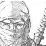
I have been posting my progress on this Al Feldstein, Weird Fantasy inspired Spaceman piece I started two days ago for Your Web Designer. You can see my rough sketch here, and my tighten up pencil drawing here. Today I completed the piece. I inked him traditionally with a Raphael Kolinsky Sable – Fine Point Round – Size 3 brush and a Hunts 108 Nib the coloring was done digitally on the computer. I choose to use the Raphael brush as I just wasn’t getting the sharp line I wanted out of my normal Winsor & Newton Series 7
#3 brush.
Posted by Sam Kressin in Design Work, Drawing and Illustration
Posted by Sam Kressin in Design Work, Strength Monsters
The final lettering… Not too long ago I posted this video here of myself finishing up the old school hand drawn and inking portion of this lettering I did based on 1940s Marvel Stories Fiction Pulp Magazine titles.
Posted by Sam Kressin in Catch Wrestling, Design Work
Here is a new design piece I did again based on the old American Wrestling Association News Edition of Wrestling Illustrated Circa the 1970s.
Posted by Sam Kressin in Design Work
Another design piece I finished over the weekend. I based this design on the Duke Kahanamoku Vintage Circa 1960s Long Boards. You can downlaod and read my Catch Wrestling Comic book for FREE here!
TRANSCRIPTION:
The Authentic Catch Wrestling Comic Book.

Posted by Sam Kressin in Design Work, Dim Mak

Another design piece I finished today. The skulls came from my original copy of The Human Body A Text Book of Anatomy, Physiology and Hygiene by H. Newell Martin published in 1900. The font is known as Danzig 4p by Rob Villareal based on Danzig’s Danzig 4p album. Danzig’s original font is based on 1959’s The Giant Gila
 Monster movie poster. The characters under “Total Dim Mak” read, “The Death Touch” according to Danzig these characters are Vehmic Runes from a secret majical alaphabet of Germanic origin. The “Caution” area is Futura a common font used for caution signs and notices. The red excitement box and yellow backgrounds are inspired by numerious 1960s Jack Kirby, Artie Simek, Fantastic Four
 splash pages.
Posted by Sam Kressin in Comic Books, Design Work, Vlog
Posted by Sam Kressin in Catch Wrestling, Comic Books, Design Work

Another design piece I finished this weekend. Inspired by AWAs bi-weekly All Star Wrestling Publications circa the 1970s. Like I’ve said before and in other posts I don’t really enjoy doing design work like this but if you want to make comic books and be in buisness for yourself it’s a necessity.
Posted by Sam Kressin in Comic Books, Design Work

Finished up this art today. I don’t really like doing design work like this. I’d prefer to draw, ink and illustrate stories but it was work I had to complete for another currently top secret project. Other than the font everything in the piece was done by me.
Posted by Sam Kressin in Comic Books, Design Work

This is some art I worked on today. As was the case with this piece a lot of times just putting together a design like this can take far more time than it takes to draw or color the actual art work. This piece was penciled, designed and colored by me inked by Josef Rubinstein. I can’t say much more about what this is banner is going to be used for or what it is going to be apart of yet but stay tuned as soon enough all will be revealed!

![]()
![]()

![]()


